Lenticular Design Tips for Digital Inkjet production from DP Lenticular
First and foremost at the outset of any lenticular project, large or small, brief your customer on the various visual effects available and ask questions! Find out what they hope to achieve and how the print will be used. The achievable effects are:
- Flip
- Morph
- Zoom
- Motion
- 3D
You’ll see samples on this page: https://dplenticular.com/technology/lenticular-effects/
*Lenticular print samples by Triaxes (Inkjet plotter Epson. Lenticular 20 LPI 3D, view angle 28 degree)
Also it’s important to know the viewing conditions for the finished print. Is it for a large format poster to be viewed from 3-5 meters or is it an A4 sized image to be viewed at a short distance? Is the project for indoor or outdoor use?
Careful consideration of all these factors is critical and will determine the success of your project as well as deciding which lenticular material you select for your job – important to know when you are estimating the cost of the lenticular piece.
Here are some technical tips that you should consider when starting you project.
Indoor / Outdoor
Is your image designed for indoor use ? Make sure you are using a lenticular material with fire accreditations for indoor displays. DP Lenticular’s 40 LPI VLF, 3D 28 LPI UV-MF and 3D 20 LPI UV-LF are fire tested (B– s2,d0).
If your image is designed for outdoor use, keep in mind that our 3D 28 LPI UV-MF and 3D 20 LPI UV-LF are extruded with a special UV protection resin.
Making the best choice of lenticular material
Depending on
- the effect, flip / motion or 3D (depth)
- the image size
- the viewing distance
Flip/Motion:
- poster size, short viewing distance: 50 LPI-M –Motion HD, 54°, 610 µ
- large format, long viewing distance: 40 LPI Very Large Format, 49°, 838µ
3D (depth):
- post card size, short viewing distance: 62 LPI Lenstar Plus
- poster size, short viewing distance: 3D-50LPI, 41°, 864 µ
- medium format, medium viewing distance: 3D 28 LPI UV-MF, 37°, 2.15mm
- large format, long viewing distance: 3D 20 LPI UV-LF, 37°, 3 mm
These materials usage are recommendations, don’t hesitate to ask us.
Artwork creation and preparation
Flip Effect
![]() DO use two frames in the Flip effect. Keep flip effects simple. More than two frames can be used, but fewer frames are preferred for a clearer, more effective message. It’s better if a flip effect covers only a part of the image rather than be an all over effect. Try and make the flip in similar colours and shades.
DO use two frames in the Flip effect. Keep flip effects simple. More than two frames can be used, but fewer frames are preferred for a clearer, more effective message. It’s better if a flip effect covers only a part of the image rather than be an all over effect. Try and make the flip in similar colours and shades.
![]() DON’T use white as a background colour – it is more likely to cause ghosting. Try to avoid using really dark colours as a background as this will obscure the animation. Using high contrast colours in your flip will probably cause ghosting where both images are visible together rather than a clean sharp flip from one to another. As with all flip and motion effects, try to avoid blue sky as a background or use separate layers if you have to use blue sky.
DON’T use white as a background colour – it is more likely to cause ghosting. Try to avoid using really dark colours as a background as this will obscure the animation. Using high contrast colours in your flip will probably cause ghosting where both images are visible together rather than a clean sharp flip from one to another. As with all flip and motion effects, try to avoid blue sky as a background or use separate layers if you have to use blue sky.
![]() DON’T have type overlapping. Having typography flip to more typography can be problematic but can be done successfully. Flip typography can be effective.
DON’T have type overlapping. Having typography flip to more typography can be problematic but can be done successfully. Flip typography can be effective.
![]() DON’T use a very small type with Flip Effects. Try to avoid using smaller type styles in lenticular print, as the lenticular lens will reduce readability.
DON’T use a very small type with Flip Effects. Try to avoid using smaller type styles in lenticular print, as the lenticular lens will reduce readability.
Zoom Effect
![]() DO consider two major factors: colour choice and image placement in producing the job.
DO consider two major factors: colour choice and image placement in producing the job.
![]() DO use bright, strong imagery to produce the best Zoom Effect results.
DO use bright, strong imagery to produce the best Zoom Effect results.
![]() DO use a separate layer on your design for the Zoom Effect if you have more than one lenticular effect in your design. The Zoom Effect may be used for logos or type.
DO use a separate layer on your design for the Zoom Effect if you have more than one lenticular effect in your design. The Zoom Effect may be used for logos or type.
![]() DON’T use white or really light coloured backgrounds. Light coloured backgrounds can be used, but, as with flip images, they are more likely to cause ghosting.
DON’T use white or really light coloured backgrounds. Light coloured backgrounds can be used, but, as with flip images, they are more likely to cause ghosting.
Motion Effect
This effect is mostly printed with horizontal lenticules on small format lenticular pictures. It becomes very difficult on a large format inkjet print. Ideally, the images should be just slightly different.
![]() DO start with video films or equivalent to get the next frame movement for animations. Computer generated art is also good.
DO start with video films or equivalent to get the next frame movement for animations. Computer generated art is also good.
![]() DON’T try to make the animation too complex or the design becomes too busy and will not produce an effective lenticular animation.
DON’T try to make the animation too complex or the design becomes too busy and will not produce an effective lenticular animation.
![]() DON’T have movement that goes from one side of the card to the other. Not all sequences are candidates for animation.
DON’T have movement that goes from one side of the card to the other. Not all sequences are candidates for animation.
![]() DON’T use full motion animation for POP.
DON’T use full motion animation for POP.
![]() DON’T use really small type with Motion effect – the lenticular lens will reduce readability.
DON’T use really small type with Motion effect – the lenticular lens will reduce readability.
Morph Effect
As with the motion effect, this is very difficult to achieve on a large format inkjet print.
![]() DO use a minimum of three frames for a Morph Effect. The Morph Effect starts with one image and slowly transforms into another image. You need the images for the start, the end and the frames between.
DO use a minimum of three frames for a Morph Effect. The Morph Effect starts with one image and slowly transforms into another image. You need the images for the start, the end and the frames between.
![]() DO include elements similar in shape and colour in your design, this will create a clean morph from start to end for a perfect Morph Effect. Morphing faces are a good example where the facial features are all on the same scale.
DO include elements similar in shape and colour in your design, this will create a clean morph from start to end for a perfect Morph Effect. Morphing faces are a good example where the facial features are all on the same scale.
![]() DON’T use small type, the lenticular lens will reduce readability. Ghosting can also occur if you have animating elements in your design that are not close enough to each other.
DON’T use small type, the lenticular lens will reduce readability. Ghosting can also occur if you have animating elements in your design that are not close enough to each other.
3D (Depth) Effect
![]() DO consider two major factors: colour choice and image placement when going for the perfect 3D look.
DO consider two major factors: colour choice and image placement when going for the perfect 3D look.
![]() DO use bright, light imagery to produce the best 3D Effect results. Elements that overlap slightly with good depth cues will enhance the illusion of depth.
DO use bright, light imagery to produce the best 3D Effect results. Elements that overlap slightly with good depth cues will enhance the illusion of depth.
![]() DO use logos and typography near the mid-plane where they will appear the sharpest and most readable. Avoid very fine type and serif type faces.
DO use logos and typography near the mid-plane where they will appear the sharpest and most readable. Avoid very fine type and serif type faces.
![]() DO use soft, less detailed images for the best effect on the background and foreground layers instead of using overly complex images that will only decrease the 3D Effect.
DO use soft, less detailed images for the best effect on the background and foreground layers instead of using overly complex images that will only decrease the 3D Effect.
![]() DON’T use backgrounds with solid horizontal stripes if possible, as this cannot create a depth reference for the observer.
DON’T use backgrounds with solid horizontal stripes if possible, as this cannot create a depth reference for the observer.
Font Style Tips
![]() DON’T use serif or italic font styles. They lose definition under the lens.
DON’T use serif or italic font styles. They lose definition under the lens.
![]() DON’T use fancy or complicated fonts as they result in reduced readability under the lens.
DON’T use fancy or complicated fonts as they result in reduced readability under the lens.
Image resolution
When processing the image before printing, you’ll need to specify the image resolution in PPI (pixels per inch). The printer driver will receive the image for processing in PPI which is its physical resolution. Attention: PPI is not equal to DPI (dots per inch).
When printing, a number of dots are needed to create one pixel, this is why printer resolution in DPI is usually higher than the one in PPI.
Printing Tips
- Start with the pitch test (archive with images for testing lenticular pitch from DPLenticular): http://dplenticular.com/uploads/pitch/Pitch_n_Skew_StarterPack.zip
There is the link to instruction How to make Pitch test in Triaxes software.
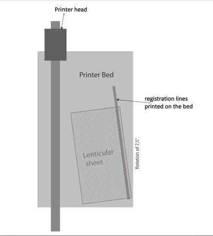
- To ensure good print to lens registration print a Skew bar (registration lines) onto the bed of your machine or on a thin tape (or Kraft paper) placed on the bed of the machine. This should be positioned in the centre or on the side of the sheet / image to be printed and turned 7.5°.
- Place the lens to be printed onto the bed of the machine and position the sheet so the skew bar image is straight and centralised when viewed in line.
- Place the sheet perfectly on the registration lines
- Print in “fine art – high res” mode.
- Always check that your inks are compatible with the job material before commencing printing.
- For the first tests you can print on another substrate and place the sheet on top to see if it looks correct. This avoids wasting material!
- When you think it’s good you can also print on the protection liner (3D 20 LPI UV-LF and 3D 28 LPI UV-MF) and finally release the liner when you are sure it works, and print your final image direct to the lens.
- Print “ turning the image 7.5° ” see below*
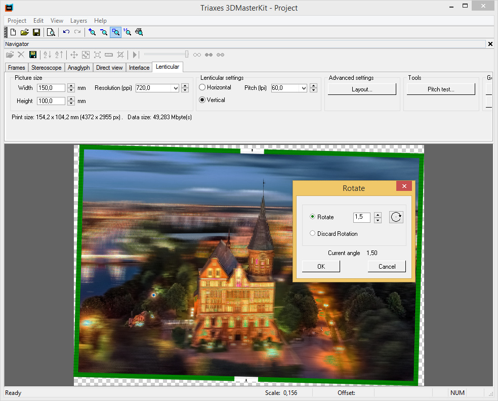
*Comments from Triaxes: Rotation the lenticular image before printing can reduce moire effect (banding).
Moire effect could appears as a result of interference of lenticular lenses with regular (periodic) raster of ink dots on some printer devices. It depends on method of rasterization in printer driver. There are different angles of rasterization for different ink colors.
You could see this moire if you put lenticular on some illustration in any journal (usually in offset printing the regular raster is used). Moire effect is not appears while stochastic rasterization is used.
Usually you don’t need rotate the image while print lenticulars on inkjet.
But, if the moire appears you may experimentally find the needed angle of rotation. To do this, apply the lenticular to the image and rotate until the moire disappears, measure and remember this angle.
Then you can use the found angle value. You can rotate the interlaced (encoded) image in 3DMasterKit before printing from the program (Edit-Transform-Rotate …). It is also possible to save the rotated image for later use (however, we would recommend to save without rotating, and rotate just before printing).